
Seaborn Module 사용법
05 Dec 2019 | Machine_Learning Visualization목차
- 1. Seaborn 모듈 개요
- 2. Plot Aesthetics
- 3. Plotting Functions
- 4. Multi-plot grids
- Reference
1. Seaborn 모듈 개요
Seaborn은 Matplotlib에 기반하여 제작된 파이썬 데이터 시각화 모듈이다. 고수준의 인터페이스를 통해 직관적이고 아름다운 그래프를 그릴 수 있다. 본 글은 Seaborn 공식 문서의 Tutorial 과정을 정리한 것임을 밝힌다.
그래프 저장 방법은 아래와 같이 matplotlib과 동일하다.
fig = plt.gcf()
fig.savefig('graph.png', dpi=300, format='png', bbox_inches="tight", facecolor="white")
2. Plot Aesthetics
2.1. Style Management
sns.set_style(style=None, rc=None)
:: 그래프 배경을 설정함
- style = “darkgrid”, “whitegrid”, “dark”, “white”, “ticks”
- rc = [dict], 세부 사항을 조정함
sns.despine(offset=None, trim=False, top=True, right=True, left=False, bottom=False)
:: Plot의 위, 오른쪽 축을 제거함
- top, right, left, bottom = True로 설정하면 그 축을 제거함
- offset = [integer or dict], 축과 실제 그래프가 얼마나 떨어져 있을지 설정함
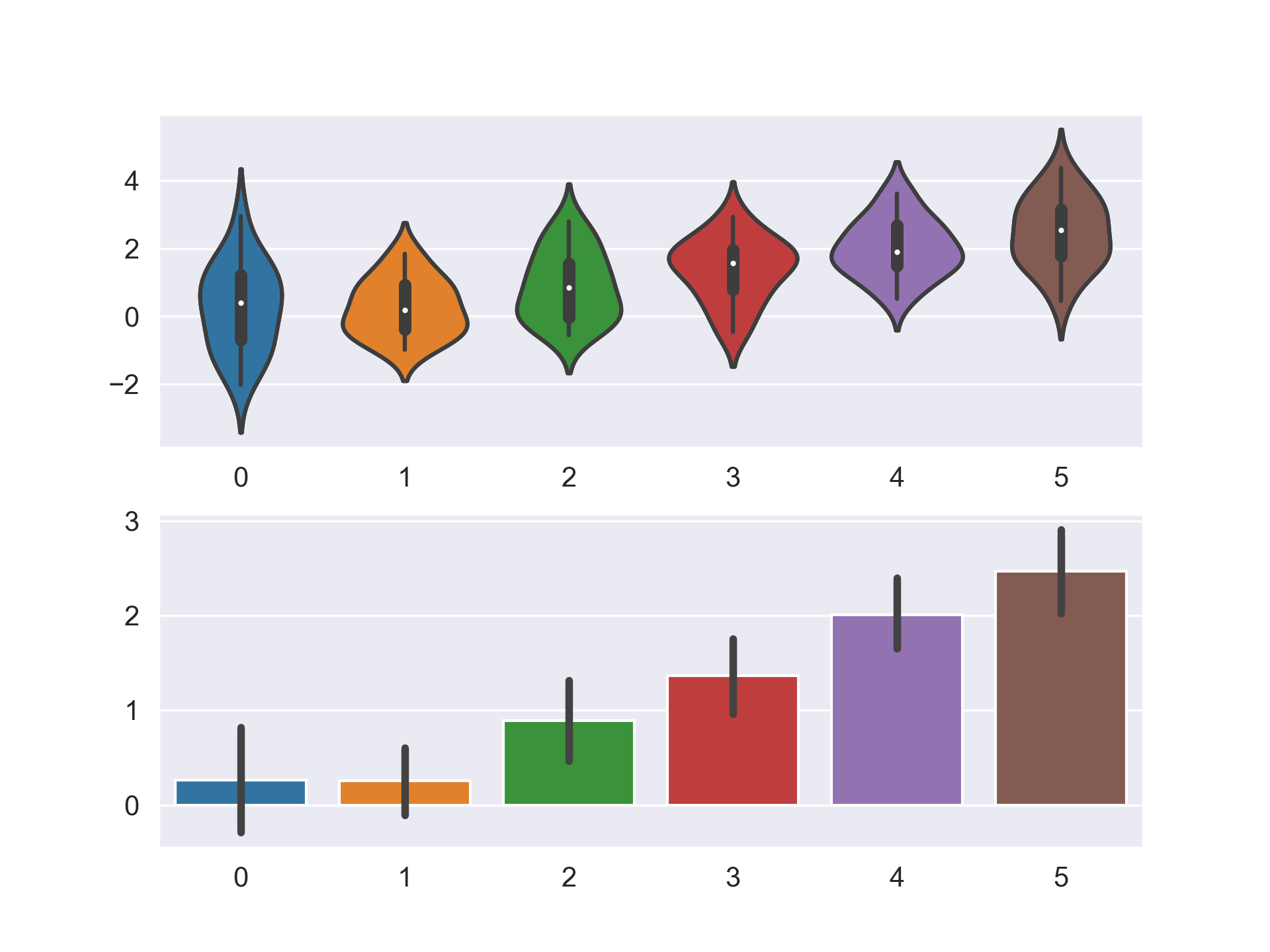
만약 일시적으로 Figure Style을 변경하고 싶다면 아래와 같이 with 구문을 사용하면 된다.
data = np.random.normal(size=(20, 6)) + np.arange(6) / 2

with sns.axes_style("darkgrid"):
    plt.subplot(211)
    sns.violinplot(data=data)
    plt.subplot(212)
    sns.barplot(data=data)
    plt.show()
전체 Style을 변경하여 지속적으로 사용하고 싶다면, 아래와 같은 절차를 거치면 된다.
sns.axes_style()

# 배경 스타일을 darkgrid로 적용하고 투명도를 0.9로
sns.set_style("darkgrid", {"axes.facecolor": "0.9"})

# 혹은 간단하게 darkgrid만 적용하고 싶다면,
sns.set(style="darkgrid")
2.2. Color Management
현재의 Color Palette를 확인하고 싶다면 다음과 같이 코드를 입력하면 된다.
current_palette = sns.color_palette()
sns.palplot(current_palette)
우리는 이 Palette를 무궁무진하게 변화시킬 수 있는데, 가장 기본적인 테마는 총 6개가 있다.
deep, muted, pastel, bright, dark, colorblind
지금부터 color_palette 메서드를 통해 palette를 바꾸는 법에 대해 알아볼 것이다.
sns.color_palette(palette=None, n_colors=None)
:: color palette를 정의하는 색깔 list를 반환함
- palette = [string], Palette 이름
- n_colors = [Integer]
Palette에는 위에서 본 6가지 기본 테마 외에도, hls, husl, Set1, Blues_d, RdBu 등 수많은 matplotlib palette를 사용할 수 있다. 만약 직접 RGB를 설정하고 싶다면 아래와 같이 설정하는 것도 가능하다.
new_palette = ["#9b59b6", "#3498db", "#95a5a6", "#e74c3c", "#34495e", "#2ecc71"]
혹은 xkcd를 이용하여 이름으로 색깔을 불러올 수도 있다.
colors = ["windows blue", "amber", "greyish", "faded green", "dusty purple"]
sns.palplot(sns.xkcd_palette(colors))
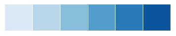
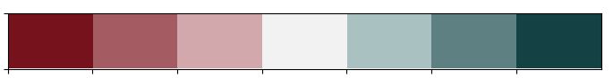
- Categorical Color Palette 대표 예시
위에서부터 paired, Set2


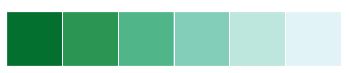
- Sequential Color Palette 대표 예시
위에서부터 Blues, BuGn_r, GnBu_d

또 하나 유용한 기능은 cubehelix palette이다.
cubehelix_palette = sns.cubehelix_palette(8, start=2, rot=0.2, dark=0, light=.95,
                                          reverse=True, as_cmap=True)
x, y = np.random.multivariate_normal([0, 0], [[1, -0.5], [-0.5, 1]], size=300).T
cmap = sns.cubehelix_palette(dark=0.3, light=1, as_cmap=True)
sns.kdeplot(x, y, cmap=cmap, shade=True)
간단한 인터페이스를 원한다면 아래와 같은 방식도 가능하다.
pal = sns.light_palette("green", reverse=False, as_cmap=True)
palt = sns.dark_palette("purple", reverse=True, as_cmap=True)
pal = sns.dark_palette("palegreen", reverse=False, as_cmap=True)
양쪽으로 발산하는 Color Palette를 원한다면, 아래와 같은 방식으로 코드를 입력하면 된다.
diverging_palette = sns.color_palette("coolwarm", 7)
diverging_palette = sns.diverging_palette(h_neg=10, h_pos=200, s=85, l=25, n=7,
                                          sep=10, center='light', as_cmap=False)

# h_neg, h_pos = anchor hues, [0, 359]
# s: anchor saturation
# l: anchor lightness
# n: number of colors in the palette
# center: light or dark
아래 결과는 다음과 같다.
또한, 만약 color_palette 류의 메서드로 하나 하나 설정을 바꾸는 것이 아니라 전역 설정을 바꾸고 싶다면, set_palette를 이용하면 된다.
sns.set_palette('hust')
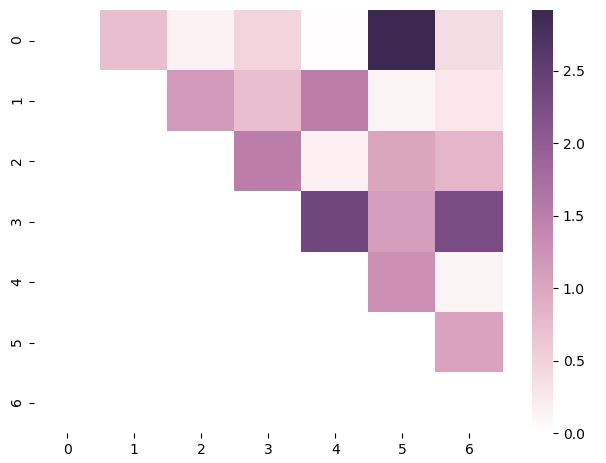
참고로 cubeleix palette를 이용하여 heatmap을 그리는 방법에 대해 첨부한다.
arr = np.array(np.abs(np.random.randn(49))).reshape((7,7))
mask = np.tril_indices_from(arr)
arr[mask] = False

palette = sns.cubehelix_palette(n_colors=7, start=0, rot=0.3,
                                light=1.0, dark=0.2, reverse=False, as_cmap=True)
sns.heatmap(arr, cmap=palette)
plt.show()
3. Plotting Functions
Seaborn의 Plotting 메서드들 중 가장 중요한 위치에 있는 메서드들은 아래와 같다.
| 메서드 | 기능 | 종류 |
|---|---|---|
| relplot | 2개의 연속형 변수 사이의 통계적 관계를 조명 | scatter, line |
| catplot | 범주형 변수를 포함하여 변수 사이의 통계적 관계를 조명 | swarm, strip, box, violin, bar, point |
데이터의 분포를 그리기 위해서는 distplot, kdeplot, jointplot 등을 사용할 수 있다.
3.1. Visualizing statistical relationships
sns.relplot(x, y, kind, hue, size, style, data, row, col, col_wrap, row_order, col_order, palette, …)
:: 2개의 연속형 변수 사이의 통계적 관계를 조명함, 각종 옵션으로 추가적으로 변수를 삽입할 수도 있음
- hue, size, style = [string], 3개의 변수를 더 추가할 수 있음
- col = [string], 여러 그래프를 한 번에 그릴 수 있게 해줌. 변수 명을 입력하면 됨
- kind = [string], scatter 또는 line 입력
- 자세한 설명은 이곳을 확인
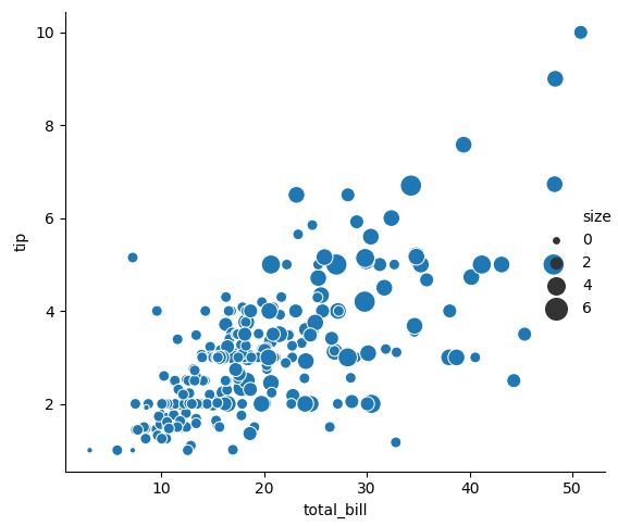
3.1.1. Scatter plot
sns.relplot(x="total_bill", y="tip", size="size", sizes=(15, 200), data=tips)
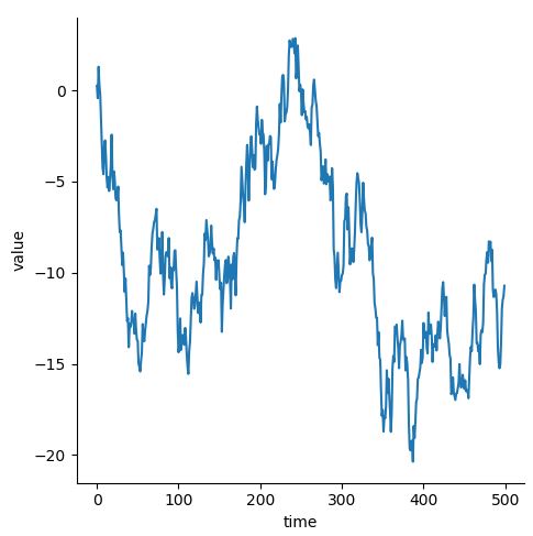
3.1.2. Line plot
- 일반적인 Line Plot
df = pd.DataFrame(dict(time=np.arange(500),
                     value=np.random.randn(500).cumsum()))
sns.relplot(x="time", y="value", kind="line", data=df)
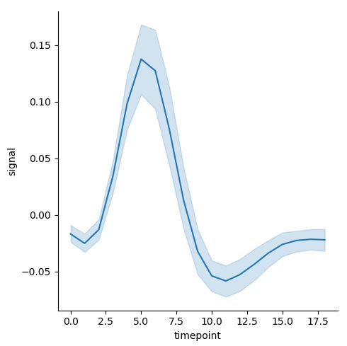
- 같은 x 값에 여러 y가 존재할 때 (Aggregation)
데이터가 아래와 같이 생겼다고 가정하자. (timepoint 값에 여러 개의 signal 값이 존재하는 상황)
| subject | timepoint | event | region | signal |
|---|---|---|---|---|
| s13 | 18 | stim | parietal | -0.017 |
| s5 | 14 | stim | parietal | -0.081 |
| s12 | 14 | stim | parietal | -0.810 |
| s11 | 18 | stim | parietal | -0.0461 |
| s10 | 18 | stim | parietal | -0.0379 |
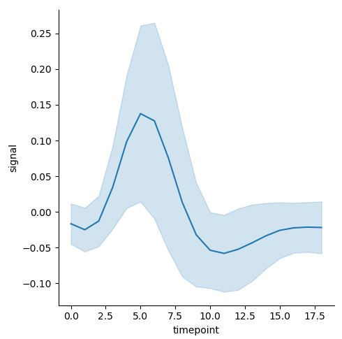
이 때, 위와 같은 경우에는 자연스럽게 Confidence Interval이 추가된다. 만약 이를 제거하고 싶으면, argument에 ci=None을 추가하면 되며, 만약 ci=”sd”로 입력하면, 표준편차가 표시된다.
sns.relplot(x="timepoint", y="signal", kind="line", data=fmri, ci="sd")
우측이 ci=”sd”이다.
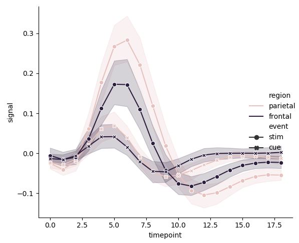
여러 변수 사이의 관계를 탐구하기 위해 다음과 같은 그래프를 그릴 수도 있다.
pal = sns.cubehelix_palette(light=0.8, n_colors=2)
sns.relplot(x="timepoint", y="signal", hue="region", style="event",
            palette=pal, dashes=False, markers=True, kind="line", data=fmri)
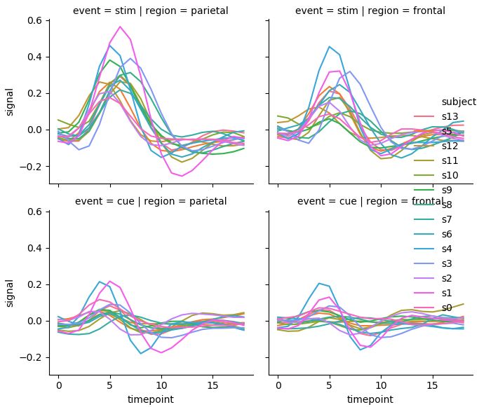
3.1.3. 여러 그래프 한 번에 그리기
여러 그래프를 한 번에 그리고 싶다면 아래와 같은 방법을 사용하면 된다. 이는 다른 seaborn 메서드에도 두루 적용할 수 있는 방법이다. col에 지정된 변수 내 값이 너무 많으면, col_wrap[integer]을 통해 한 행에 나타낼 그래프의 수를 조정할 수 있다.
# Showing multiple relationships with facets
sns.relplot(x="timepoint", y="signal", hue="subject", col="region",
            row="event", height=3, kind="line", estimator=None, data=fmri)
3.2. Plotting with categorical data
범주형 변수를 포함한 여러 변수들의 통계적 관계를 조명하는 catplot은 kind=swarm, strip, box, violin, bar, point 설정을 통해 다양한 그래프를 그릴 수 있게 해준다.
sns.catplot(x, y, kind, hue, data, row, col, col_wrap, order, row_order, col_order, hue_order, palette, …)
:: 범주형 변수를 포함한 여러 변수들의 통계적 관계를 조명함
- x, y, hue = [string], 그래프를 그릴 변수들의 이름
- row, col = [string], faceting of the grid를 결정할 범주형 변수의 이름
- 자세한 설명은 이곳을 확인
3.2.1. Categorical Scatterplots: strip, swarm
sns.catplot(x="day", y="total_bill", jitter=False, data=tips)
sns.catplot(x="day", y="total_bill", hue="sex", kind="swarm",
            order=["Sun", "Sat", "Thur", "Fri"], data=tips)
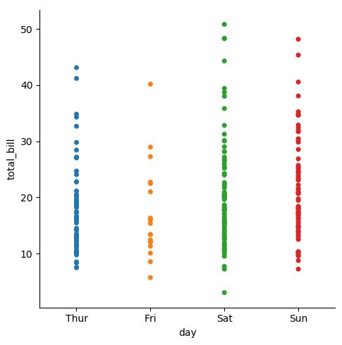
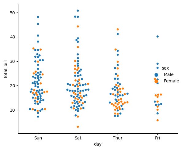
swarm 그래프는 그래프 포인트끼리 겹치는 것을 막아준다. (overlapping 방지) 가로로 그리고 싶으면, x와 y의 순서를 바꿔주면 된다.
3.2.2. Distribution of observations within categories: box, violin
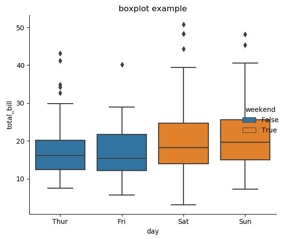
위와 같은 그래프에서 분포를 잘 알아보기 위해서는 다음과 같은 기능을 사용하면 된다.
tips["weekend"] = tips["day"].isin(["Sat", "Sun"])
sns.catplot(x="day", y="total_bill", hue="weekend", orient='v',
kind="box", dodge=False, data=tips, legend=True)
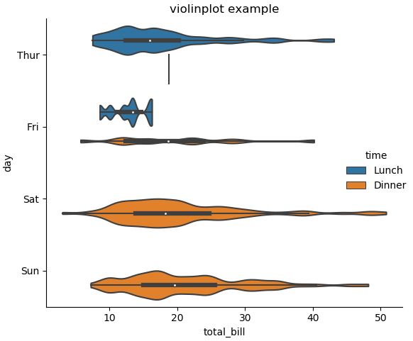
sns.catplot(x="total_bill", y="day", hue="time",
kind="violin", bw=.15, cut=0, data=tips)
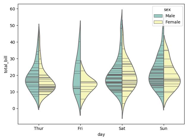
그래프 내부에 선(Inner Stick)을 추가하고 싶거나, Scatter Plot과 Distribution Plot을 동시에 그리고 싶다면 아래의 기능을 사용하면 된다.
# Inner Stick 사용
sns.violinplot(x="day", y="total_bill", hue="sex", data=tips,
split=True, inner="stick", palette="Set3")
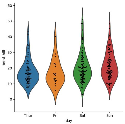
# 결합: 분포와 실제 데이터까지 한번에 보여주는 방법
g = sns.catplot(x="day", y="total_bill", kind="violin", inner=None, data=tips)
sns.swarmplot(x="day", y="total_bill", color="k", size=3, data=tips, ax=g.ax)
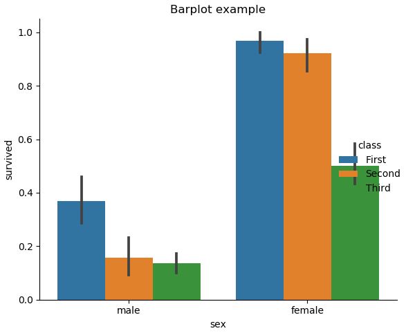
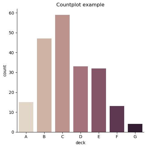
3.2.3. Statistical Estimation within categories: barplot, countplot, pointplot
아래는 기본적인 Barplot, Countplot, Pointplot을 그리는 방법에 대한 소개이다.
# bar
sns.catplot(x="sex", y="survived", hue="class", kind="bar", data=titanic)
# 그냥 count를 세고 싶다면
sns.catplot(x="deck", kind="count", palette="ch:.25", data=titanic)
# point
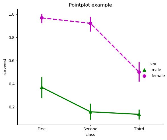
sns.catplot(x="class", y="survived", hue="sex", data=titanic,
palette={"male": "g", "female": "m"}, kind="point",
markers=["^", "o"], linestyles=["-", "--"])
3.2.4. Showing multiple relationships with facets
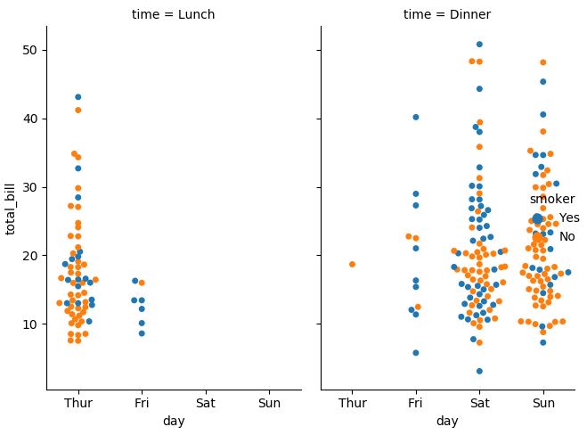
# catplot 역시 relplot 처럼 col argument를 사용해 여러 그래프를 그릴 수 있음
sns.catplot(x="day", y="total_bill", hue="smoker",
            col="time", aspect=0.6, kind="swarm", data=tips)
3.3. Visualizing the distribution of a dataset
3.2.1. 일변량 분포
sns.distplot(a, bins, hist=True, rug=False, fit=None, color=None, vertical=False, norm_hist=False, axlabel, label, ax …)
:: 관찰 값들의 일변량 분포를 그림
- a = [Series, 1d array, list], Observed data이며, Series에 name 속성이 있다면 이것이 label로 사용될 것임
- hist = [bool], True면 히스토그램을 그림
- 자세한 설명은 이곳을 확인
다음은 예시이다.
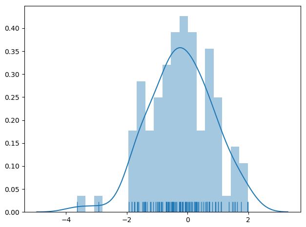
x = np.random.normal(size=100)
sns.distplot(x, hist=True, bins=20, kde=True, rug=True)
sns.kdeplot(data, data2, shade=False, vertical=False, kernel=’gau’, bw=’scott’, gridsize=100, cut=3, legend=True …)
:: 일변량 or 이변량의 Kernel Density Estimate 그래프를 그림
- data = [1d array-like], Input Data
- data2 = [1d array-like], 2번째 Input Data, 옵션이며 추가할 경우 이변량 KDE가 그려질 것임
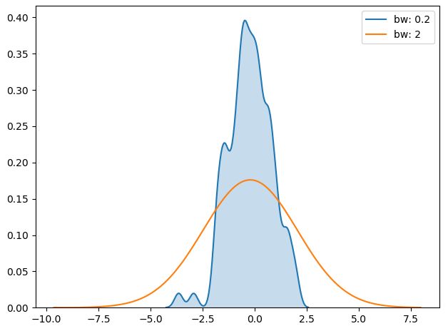
- bw = {‘scott’, ‘silverman’, scalar, pair of scalars}, kernel size를 결정함, 히스토그램에서의 bin size와 유사한 역할을 수행함, bw 값이 작을 수록 실제 데이터에 근접하게 그래프가 그려짐
- gridsize = [int], Evaluation Grid에서의 이산형 포인트의 개수
- cut = [scalar], 그래프의 시작 지점을 설정함
- 자세한 설명은 이곳을 확인
sns.kdeplot(x, shade=True, bw=0.2, label='bw: 0.2')
sns.kdeplot(x, shade=False, bw=2, label='bw: 2')
plt.legend(loc='best')
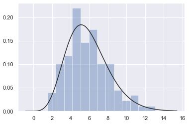
x = np.random.gamma(6, size=200)
sns.distplot(x, kde=False, fit=stats.gamma)
3.2.2. 이변량 분포
# Prep
mean, cov = [0, 1], [(1, .5), (.5, 1)]
data = np.random.multivariate_normal(mean, cov, 200)
df = pd.DataFrame(data, columns=["x", "y"])
x, y = np.random.multivariate_normal(mean, cov, 1000).T
cmap = sns.cubehelix_palette(as_cmap=True, start=0, rot=0.5, dark=0, light=0.9)
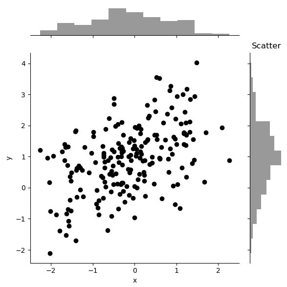
# Scatter plot
sns.jointplot(x="x", y="y", data=df, color='k')
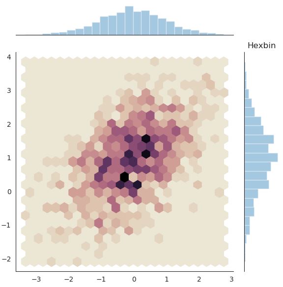
# Hexbin plot
with sns.axes_style("white"):
sns.jointplot(x=x, y=y, kind="hex", cmap=cmap)
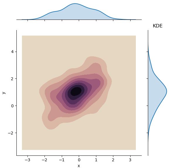
# Kernel Density Estimation
sns.jointplot(x="x", y="y", data=df, kind="kde", cmap=cmap)
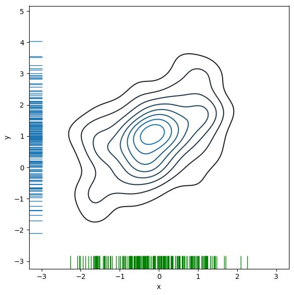
이변량 분포에서 KDE와 rug를 결합하면 아래와 같은 그래프를 그릴 수도 있다.
f, ax = plt.subplots(figsize=(6, 6))
sns.kdeplot(df.x, df.y, ax=ax)
sns.rugplot(df.x, color="g", ax=ax)
sns.rugplot(df.y, vertical=True, ax=ax);
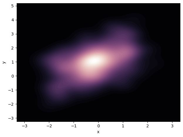
만약 Density의 연속성을 부드럽게 표현하고 싶다면, Contour Level을 조 정하면 된다.
cmap = sns.cubehelix_palette(as_cmap=True, dark=0, light=1, reverse=True)
sns.kdeplot(df.x, df.y, cmap=cmap, n_levels=60, shade=True)
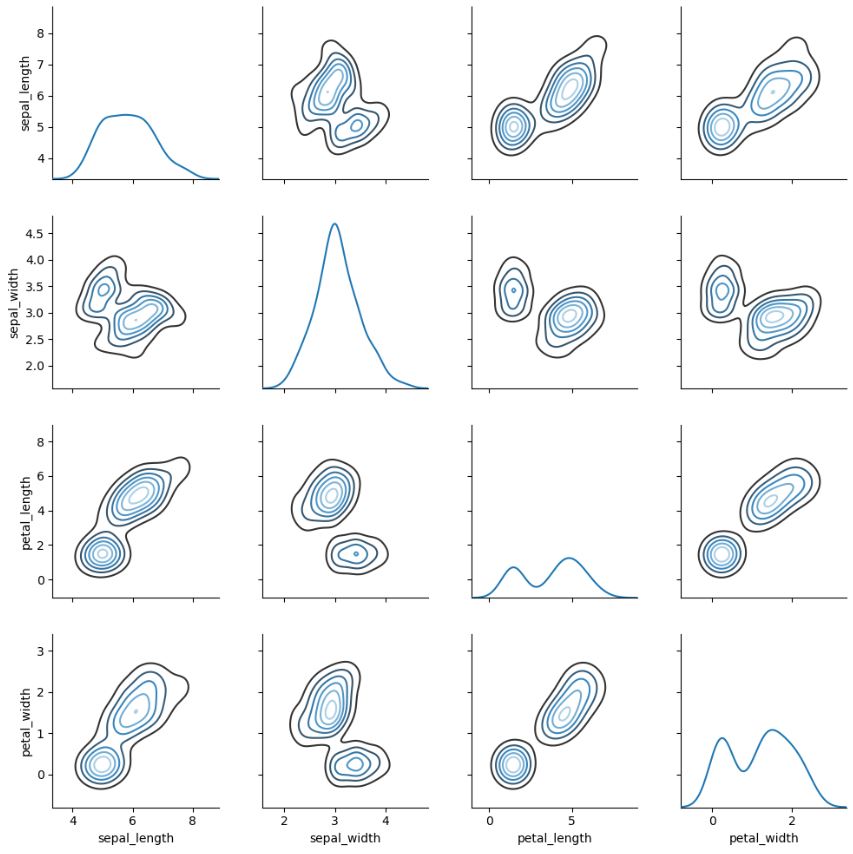
3.2.3. Pairwise 관계 시각화
iris = sns.load_dataset('iris')
sns.pairplot(iris)

g = sns.PairGrid(iris)
g.map_diag(sns.kdeplot)
g.map_offdiag(sns.kdeplot, cmap="Blues_d", n_levels=6);
4. Multi-plot grids
이곳을 참조할 것