
seaborn 사용법(python seaborn 사용법)
13 May 2023 | seaborn matplotlib usage목차
이 글에서는 python seaborn의 사용법을 정리한다.
따로 명시하지 않으면 이 글에서의 예제 데이터는 다음으로 설정한다.
data = pd.DataFrame(data={
    'A': [1,4,3,6,5,8,7,9],
    'B': [6,5,7,8,9,9,8,9],
    'C': [8.8,7.7,6.6,5.5,4.4,3.3,2.2,1.1]
})
seaborn 설치
설치는 꽤 간단하다.
pip install seaborn
import는 관례적으로 다음과 같이 한다.
import seaborn as sns
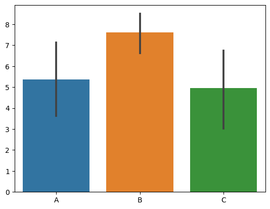
막대 그래프(barplot)
sns.barplot(data=data)
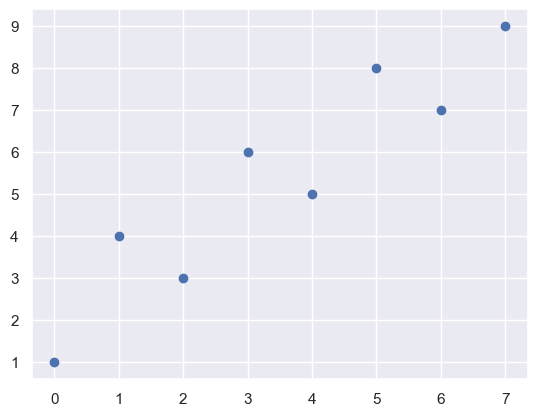
그래프 배경 설정(set)
- 기본값은
style="darkgrid"이고darkgrid, whitegrid, dark, white, ticks테마가 있다. sns.set(style='darkgrid')또는sns.set_style('whitegrid')와 같이 사용한다.
sns.set()
plt.scatter(x=data.index, y=data['A'])
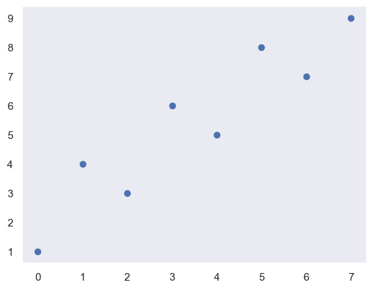
sns.set_style('dark')
plt.scatter(x=data.index, y=data['A'])
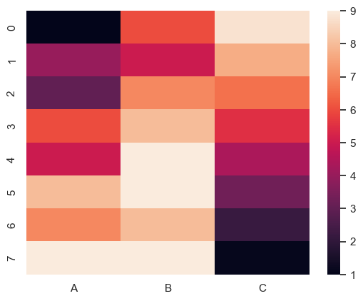
Heatmap
sns.heatmap(data)
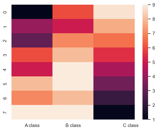
눈금 값 설정(xticks, yticks)
heatmap을 구성하는 각 box의 중심 좌표는 제일 왼쪽 아래가 (0.5, 0.5)이다. 즉 0.5만큼을 더해줘야 한다. 여기서 벗어나게 지정할 수도 있지만 이상해 보인다.
sns.heatmap(data)
plt.xticks([0.5, 1.5, 2.9], ["A class", "B class", "C class"])
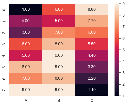
데이터 값 표시(annot, fmt)
- 데이터 값을 표시하려면
annot=True를 지정한다. fmt인자는d,.2f와 같이 지정할 수 있다.
sns.heatmap(data, annot = True, fmt = ".2f")
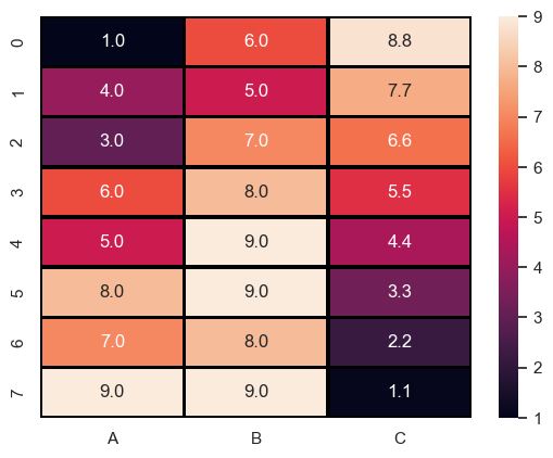
선 스타일 설정
다른 그래프와 비슷하게 linewidth, linecolor로 설정할 수 있다.
sns.heatmap(data, annot = True, fmt = ".1f", linewidth = 2, linecolor = "black")
Colormap 설정
sns.heatmap(data, annot = True, fmt = ".2f", cmap = "Blues", linewidth = 1, linecolor = "black")
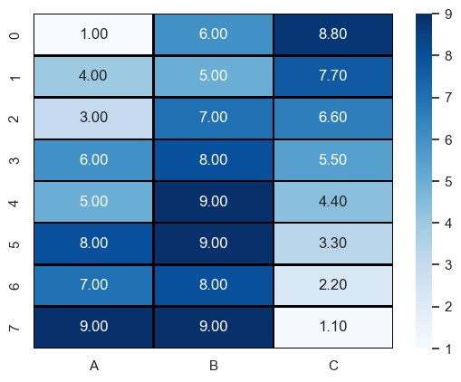
cmap은 아래 그림들을 참조하자.
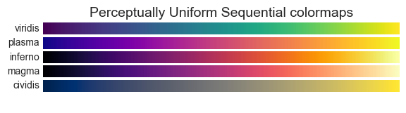
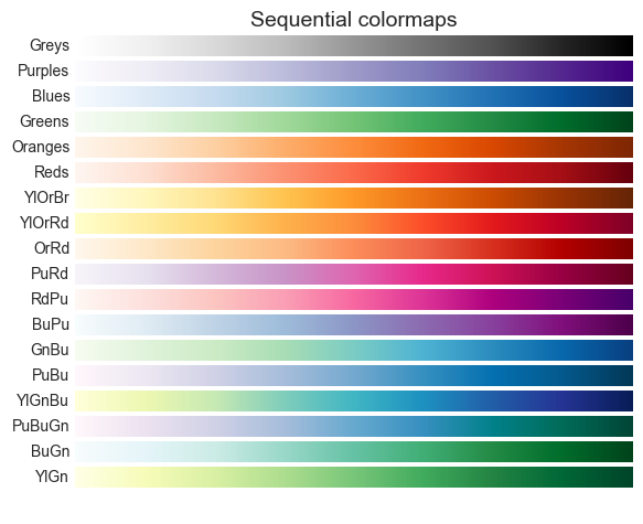
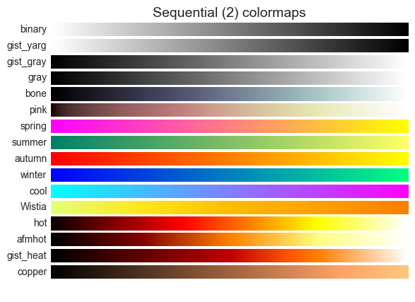

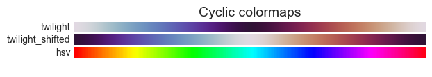
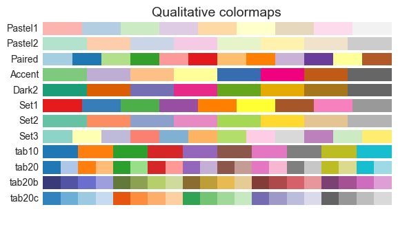
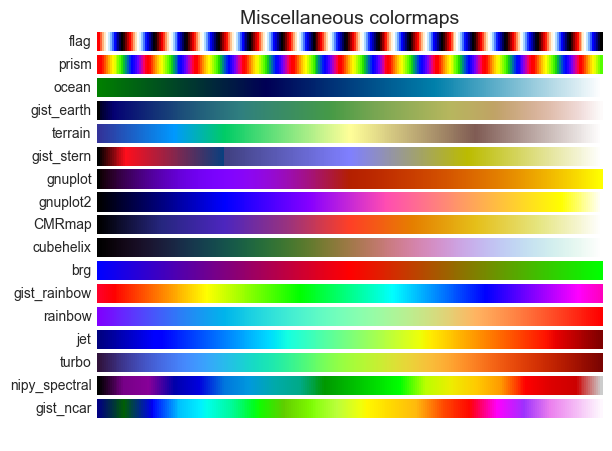
위 그림은 아래 코드로 생성할 수 있다.
import numpy as np
import matplotlib as mpl
import matplotlib.pyplot as plt

cmaps = {}

gradient = np.linspace(0, 1, 256)
gradient = np.vstack((gradient, gradient))


def plot_color_gradients(category, cmap_list):
    # Create figure and adjust figure height to number of colormaps
    nrows = len(cmap_list)
    figh = 0.35 + 0.15 + (nrows + (nrows - 1) * 0.1) * 0.22
    fig, axs = plt.subplots(nrows=nrows + 1, figsize=(6.4, figh))
    fig.subplots_adjust(top=1 - 0.35 / figh, bottom=0.15 / figh,
                        left=0.2, right=0.99)
    axs[0].set_title(f'{category} colormaps', fontsize=14)

    for ax, name in zip(axs, cmap_list):
        ax.imshow(gradient, aspect='auto', cmap=mpl.cm.get_cmap(name))
        ax.text(-0.01, 0.5, name, va='center', ha='right', fontsize=10,
                transform=ax.transAxes)

    # Turn off *all* ticks & spines, not just the ones with colormaps.
    for ax in axs:
        ax.set_axis_off()

    # Save colormap list for later.
    cmaps[category] = cmap_list
References
- https://matplotlib.org/3.7.1/tutorials/colors/colormaps.html