이 글에서는 python matplotlib의 사용법을 정리한다.
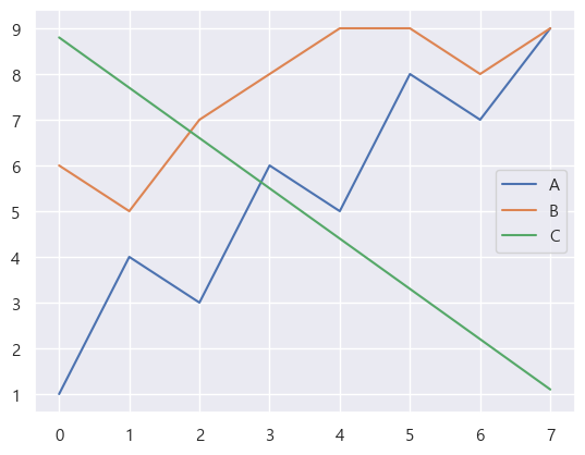
따로 명시하지 않으면 이 글에서의 예제 데이터는 다음으로 설정한다.
data = pd.DataFrame(data={
    'A': [1,4,3,6,5,8,7,9],
    'B': [6,5,7,8,9,9,8,9],
    'C': [8.8,7.7,6.6,5.5,4.4,3.3,2.2,1.1]
})
matplotlib 설치
설치는 꽤 간단하다.
import는 관례적으로 다음과 같이 한다.
from matplotlib import pyplot as plt
import numpy as np
import pandas as pd
Font 설정
아무 설정을 하지 않으면 한글이 깨지는 경우가 많다.
RuntimeWarning: Glyph 44256 missing from current font.
  font.set_text(s, 0.0, flags=flags)
보통 다음과 같이 설정해주면 된다.
from matplotlib import rcParams
rcParams["font.family"] = "Malgun Gothic"
rcParams["axes.unicode_minus"] = False
참고로 설정 가능한 폰트 목록을 확인하고 싶다면 다음 코드를 실행해 보자.
import matplotlib.font_manager
fpaths = matplotlib.font_manager.findSystemFonts()
font_names = []
for i in fpaths:
    f = matplotlib.font_manager.get_font(i)
    font_names.append(f.family_name)

print(font_names[:5])

for fn in font_names:
    if 'malgun' in fn.lower():
        print(fn)
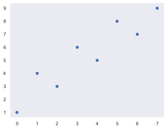
Jupyter 전용 기능
다음 magic command를 사용사면 plt.show() 함수를 사용하지 않아도 그래프를 보여준다.
plt.scatter(x=[1,2,3], y=[4,5,6])
보통의 환경이라면 plt.show() 함수를 사용해야 그래프가 보인다. PyCharm이라면 SciView 창에서 열린다.
그래프 종류
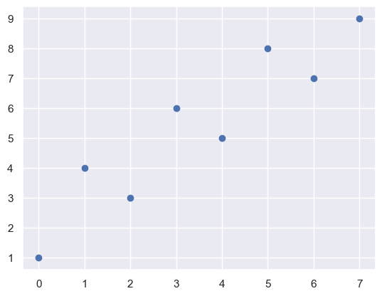
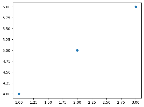
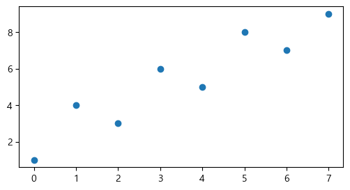
산점도(scatter)
plt.scatter(x=[1,2,3], y=[4,5,6])
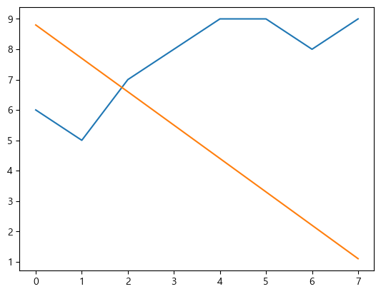
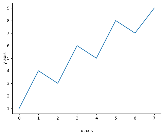
선 그래프(plot)
plt.plot(data.index, data['B'])
# 하나만 입력하면 기본 index로 그려진다.
plt.plot(data['C'])
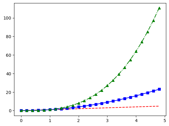
# 한 번의 plot() 호출로 여러 개를 그릴 수 있다. 순서는 x, y, fmt 순으로 입력할 수 있다.
t = np.arange(0., 5., 0.2)
plt.plot(t, t, 'r--', t, t**2, 'bs-', t, t**3, 'g^-.')
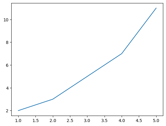
plot()은 list나 DataFrame뿐 아니라 dictionary도 그래프로 나타낼 수 있다.
data_dict = {'x': [1, 2, 3, 4, 5], 'y': [2, 3, 5, 7, 11]}
plt.plot('x', 'y', data=data_dict)
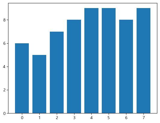
막대 그래프(bar)
plt.bar(data.index, data['B'])
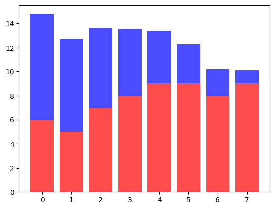
2개 그룹 동시 표시
stack해서 사용하는 방법은 다음과 같이 bottom 옵션을 사용한다.
p1 = plt.bar(data.index, data['B'], color='red', alpha=0.7)
p2 = plt.bar(data.index, data['C'], color='blue', alpha=0.7, bottom=data['B'])
# plot이 여러 개인 경우 plt.legend()는 그냥 넣으면 legend가 출력되지 않는다.
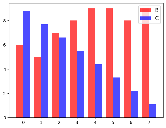
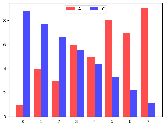
나란히 놓는 방법은 bar의 width 옵션과 x좌표를 조정하면 된다.
p1 = plt.bar(data.index-0.2, data['B'], color='red', alpha=0.7, width=0.4)
p2 = plt.bar(data.index+0.2, data['C'], color='blue', alpha=0.7, width=0.4)
plt.legend((p1, p2), ('B', 'C'), fontsize=12)
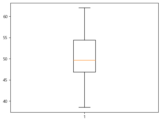
boxplot
x = np.random.normal(50, 5, 100)
plt.boxplot(x)
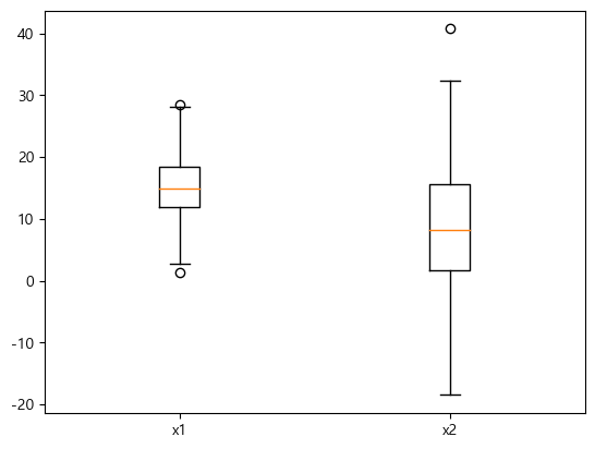
여러 boxplot을 한 번에 그리려면 리스트에 담아서 전달한다.
x1 = np.random.normal(15, 5, 500)
x2 = np.random.normal(10, 10, 100)
plt.boxplot([x1, x2])
plt.xticks([1, 2], ["x1", "x2"])
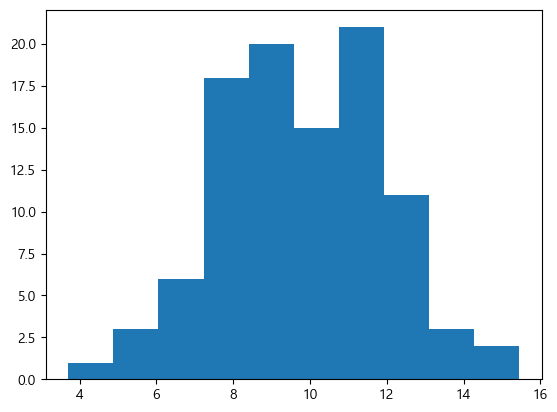
Histogram
구간 개수는 bins으로 설정한다.
x = np.random.normal(10, 2, 100)
plt.hist(x, bins=10)
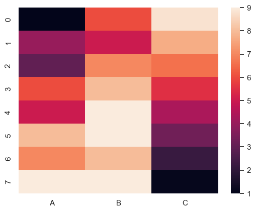
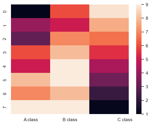
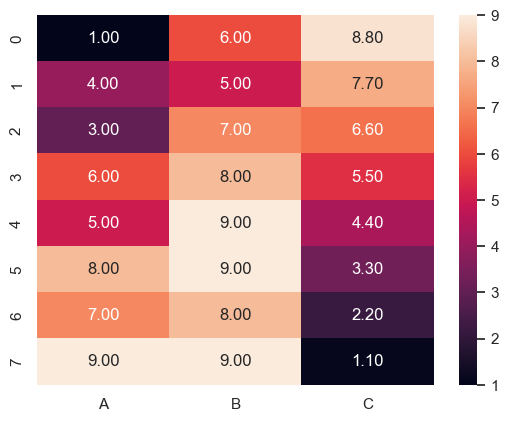
Heatmap
matshow라는 함수가 있지만 이건 seaborn의 heatmap이 더 편하다.
pd.DataFrame.plot
- pandas의 dataframe에서
.plot() method를 호출하면 바로 그래프를 그릴 수 있다.
- 종류는
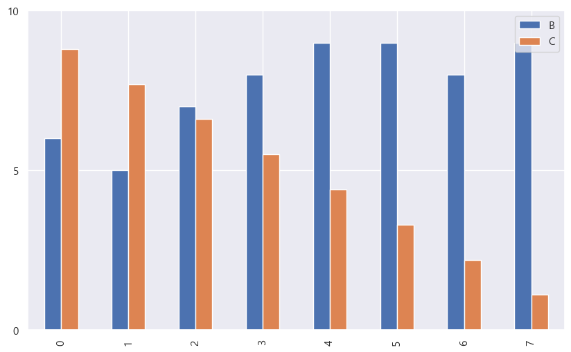
line, bar, barh, hist, box, scatter 등이 있다. barh는 수평 막대 그래프를 의미한다.
좀 더 자세하게 설정할 수도 있다. 이 글에 있는 스타일 설정을 대부분 적용할 수 있다.
data.plot(kind = "bar", y = ["B", "C"], figsize = (10, 6),
    yticks=[0, 5, 10])
단 boxplot과 histogram은 y만 설정할 수 있다.
스타일 설정
더 많은 설정은 여기를 참고하자.
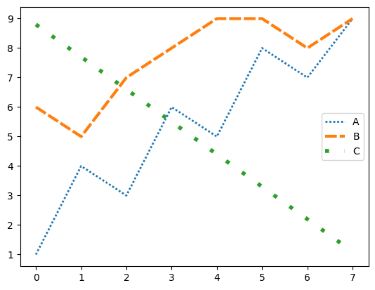
dashes 옵션으로 직접 dash line을 조작할 수 있다.markevery 옵션으로 마커를 만들 샘플을 추출할 수 있다. 옵션값이 5(int)면 5개의 샘플마다, float이면 상대적 거리에 따라 추출한다.visible 옵션으로 선을 안 보이게 할 수 있다.fillstyle 옵션으로 마커를 채우는 방식을 설정할 수 있다. full, left, right, bottom, top, none 가능
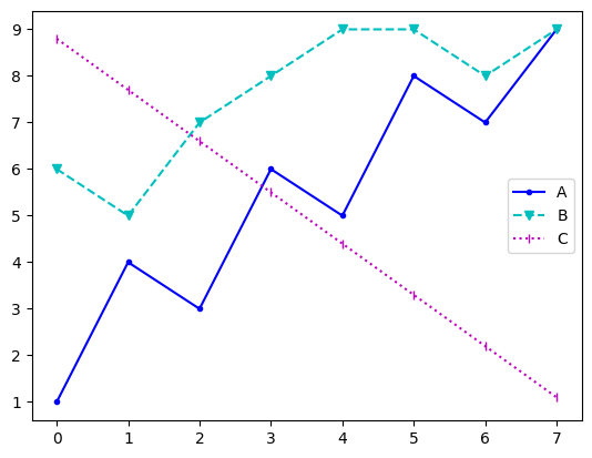
색상, 마커, 선 스타일을 쉽게 지정할 수 있다.
plt.plot(data['A'], 'b.-', label='A')
plt.plot(data['B'], 'cv--', label='B')
plt.plot(data['C'], 'm|:', label='C')
plt.legend()
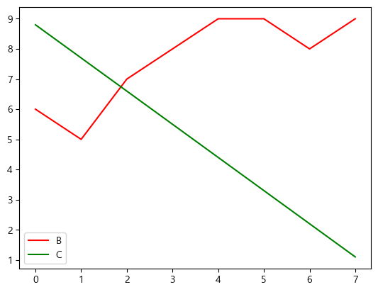
색상(color)
plt.plot(data['B'], label='B', color='red')
plt.plot(data['C'], label='C', color='green')
plt.legend()
| fmt |
color |
b |
blue |
g |
green |
r |
red |
c |
cyan |
m |
magenta |
y |
yellow |
k |
black |
w |
white |
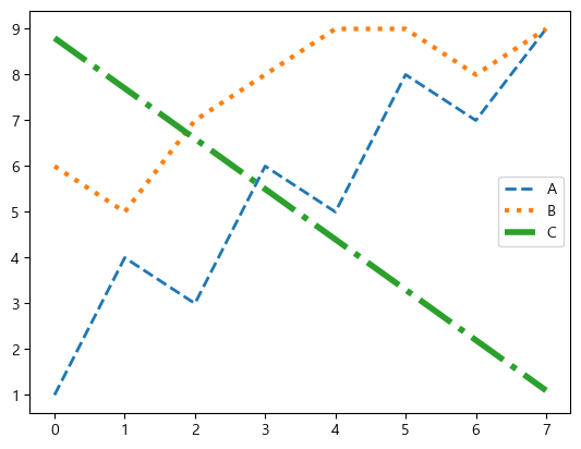
선 스타일(linestyle), 두께(linewidth)
- 선 스타일은
linestyle parameter를 전달하며 기본값인 solid와 dashed, dotted, dashdot이 있다.
- 선 두께는
linewidth로 설정하고 기본값은 1.5이다.
plt.plot(data['A'], label='A', linestyle='dashed', linewidth=2)
plt.plot(data['B'], label='B', linestyle='dotted', linewidth=3)
plt.plot(data['C'], label='C', linestyle='dashdot', linewidth=4)
plt.legend()
| fmt |
linestyle |
- |
solid |
-- |
dashed |
: |
dotted |
-. |
dashdot |
수치로 직접 지정할 수 있다. 참고로 (0, (1, 1))은 dotted, (0, (5, 5))는 dashed, (0, (3, 5, 1, 5))는 dashdot과 같다.
plt.plot(data['A'], label='A', linestyle=(0, (1,1)), linewidth=2)
plt.plot(data['B'], label='B', linestyle=(0, (4,1)), linewidth=3)
plt.plot(data['C'], label='C', linestyle=(0, (1,4)), linewidth=4)
plt.legend()
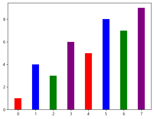
bar 스타일(width, color, linewidth)
bar의 두께를 설정할 수 있다. 각 데이터마다 다른 값을 주면 각각 다르게 설정할 수도 있다.
plt.bar(data.index, data['A'], width=0.4, color=["red", "blue", "green", "purple", "red", "blue", "green", "purple"], linewidth=2.5)
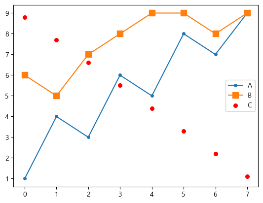
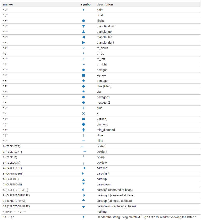
마커(marker)
각 data point마다 marker를 표시할 수 있다.
- 점:
., 원: o, 사각형: s, 별: *, 다이아몬드: D, d
- marker의 사이즈도
markersize parameter로 지정할 수 있다.
- 산점도(scatter)의 마커 크기는
s parameter로 설정한다. 단 크기가 10배 차이난다.
plt.plot(data['A'], label='A', marker='o', markersize=4)
plt.plot(data['B'], label='B', marker='s', markersize=8)
plt.scatter(data.index, data['C'], label='C', marker='.', s=120, color='red')
plt.legend()
| fmt |
marker |
설명 |
fmt |
marker |
설명 |
. |
point |
점 |
s |
square |
사각형 |
, |
pixel |
픽셀 |
p |
pentagon |
오각형 |
o |
circle |
원 |
* |
star |
별 |
v |
triangle_down |
역삼각형 |
h |
hexagon1 |
육각형 1 |
^ |
triangle_up |
삼각형 |
H |
hexagon2 |
육각형 2 |
< |
triangle_left |
삼각형(왼쪽) |
+ |
plus |
+ 모양 |
> |
triangle_right |
삼각형(오른쪽) |
x |
x |
x 모양 |
1 |
tri_down |
삼각뿔(아래쪽) |
D |
diamond |
다이아몬드 |
2 |
tri_up |
삼각뿔(위쪽) |
d |
thin diamond |
얇은 다이아몬드 |
3 |
tri_left |
삼각뿔(왼쪽) |
| |
vline |
v line |
4 |
tri_right |
삼각뿔(위쪽) |
_ |
hline |
h line |
더 많은 마커 옵션이 있다.
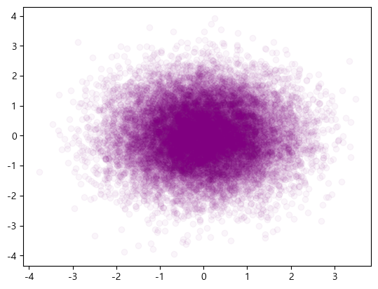
투명도(alpha)
데이터가 너무 많은 경우 투명도를 조절하면 좀 더 잘 보이게 할 수 있다.
import numpy as np
x = np.random.normal(0, 1, 16384)
y = np.random.normal(0, 1, 16384)
plt.scatter(x, y, alpha = 0.04, color='purple')
그래프 전체 설정
그래프 크기 설정
plt.figure(figsize=(6, 3))
plt.scatter(x=data.index, y=data['A'])
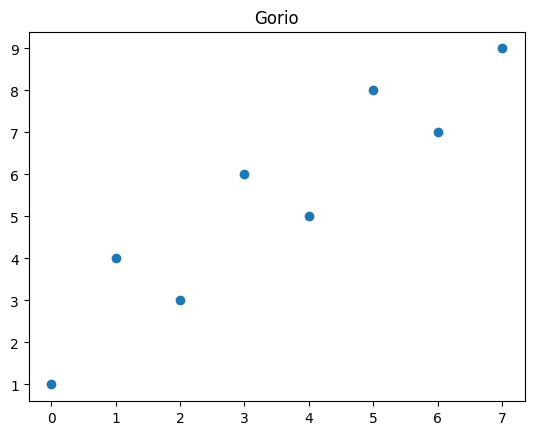
그래프 제목(title)
plt.scatter(x=data.index, y=data['A'])
plt.title("Gorio")
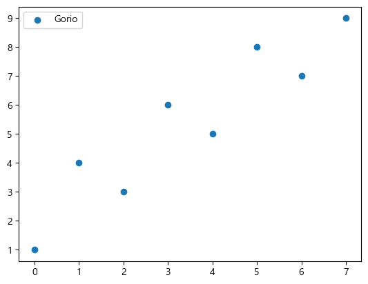
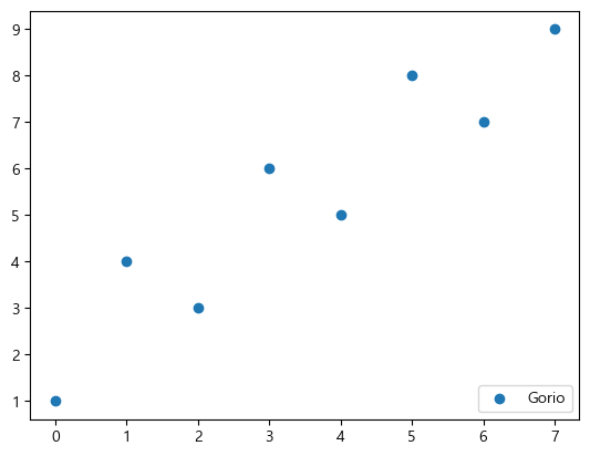
범례 설정(legend)
기본적으로 plot(label=...) 등으로 label을 등록하면, plt.legend()로 등록된 label들을 표시해주는 개념이다.
plt.scatter(x=data.index, y=data['A'], label='Gorio')
plt.legend()
legend 위치는 그래프를 가리지 않는 위치에 임의로 생성된다. 위치를 지정하려면 loc parameter를 설정한다.
plt.scatter(x=data.index, y=data['A'], label='Gorio')
plt.legend(loc='lower right')
가능한 옵션을 총 9개이다. left, center, right, upper left, upper center, upper right, lower left, lower center, lower right
참고로 loc=(0.5, 0.5)와 같이 직접 수치를 지정할 수도 있다. loc=(0.0, 0.0)은 왼쪽 아래, loc=(1.0, 1.0)은 오른쪽 위이다.
legend() 메서드에서도 label을 직접 등록하여 표시할 수 있다.
p1 = plt.bar(data.index-0.2, data['A'], color='red', alpha=0.7, width=0.4)
p2 = plt.bar(data.index+0.2, data['C'], color='blue', alpha=0.7, width=0.4)
plt.legend((p1, p2), ('A', 'C'), fontsize=12)

ncol 옵션으로 범례에 표시되는 텍스트의 열 개수를 지정할 수 있다.
p1 = plt.bar(data.index-0.2, data['A'], color='red', alpha=0.7, width=0.4, label='A')
p2 = plt.bar(data.index+0.2, data['C'], color='blue', alpha=0.7, width=0.4, label='C')
plt.legend(ncol=2)
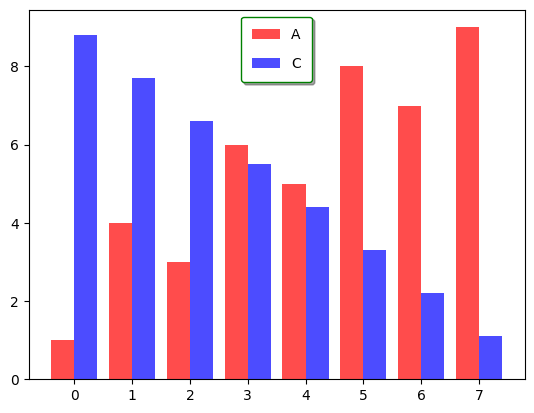
각종 다양한 스타일을 지정할 수 있다.
p1 = plt.bar(data.index-0.2, data['A'], color='red', alpha=0.7, width=0.4, label='A')
p2 = plt.bar(data.index+0.2, data['C'], color='blue', alpha=0.7, width=0.4, label='C')
plt.legend(frameon=True, shadow=True, facecolor='inherit', edgecolor='green', borderpad=0.8, labelspacing=1.1)
더 자세한 설정은 여기에서 확인 가능하다.
x, y축 설정
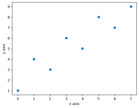
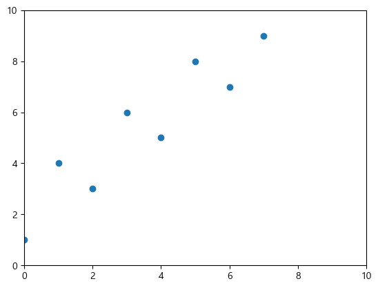
축 제목(xlabel, ylabel)
plt.scatter(x=data.index, y=data['A'])
plt.xlabel("x axis")
plt.ylabel("y axis")
축 제목과 축 간 거리는 labelpad로 조정한다.
plt.plot(data.index, data['A'])
plt.xlabel("x axis", labelpad=20)
plt.ylabel("y axis", labelpad=-1)
폰트 설정도 할 수 있다.
font1 = {'family': 'serif',
         'color': 'b',
         'weight': 'bold',
         'size': 14
         }

font2 = {'family': 'fantasy',
         'color': 'deeppink',
         'weight': 'normal',
         'size': 'xx-large'
         }

plt.plot([1, 2, 3, 4], [2, 3, 5, 7])
plt.xlabel('x Axis', labelpad=15, fontdict=font1)
plt.ylabel('y Axis', labelpad=20, fontdict=font2)
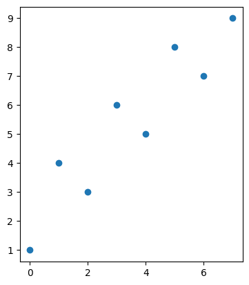
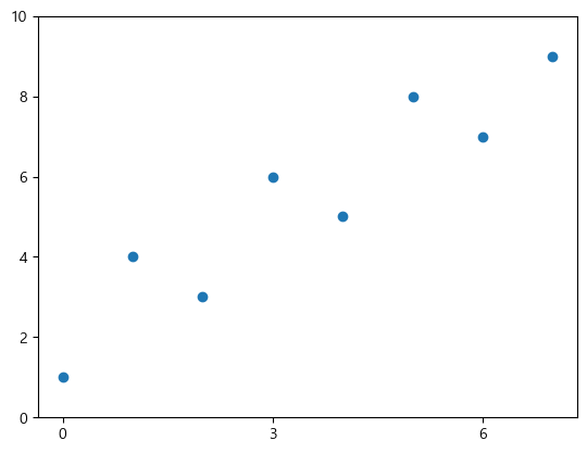
축 범위 설정(xlim, ylim, axis)
각 함수를 호출하면 return value로 x축, y축, x 및 y축의 최솟값/최댓값을 얻을 수 있다.
plt.scatter(x=data.index, y=data['A'])
xmin, xmax = plt.xlim(left=0, right=10)
ymin, ymax = plt.ylim(bottom=0, top=10)
# 아래 한 줄로도 쓸 수 있다.
# xmin, xmax, ymin, ymax = plt.axis([0,10,0,10])
참고로 left, right, bottom, top 중 설정하지 않은 값은 데이터 최솟값/최댓값에 맞춰 자동으로 설정된다.
범위를 수치로 직접 설정하는 대신 그래프의 비율이나 scale을 조정할 수 있다.
scaled의 경우 다음과 같이 x축 간격과 y축 간격의 scale이 같아진다.
plt.scatter(x=data.index, y=data['A'])
xmin, xmax, ymin, ymax = plt.axis('scaled')
# (-0.35000000000000003, 8.450000000000001, 0.6, 9.4)
다음과 같은 옵션들이 있다: 'on' | 'off' | 'equal' | 'scaled' | 'tight' | 'auto' | 'normal' | 'image' | 'square'
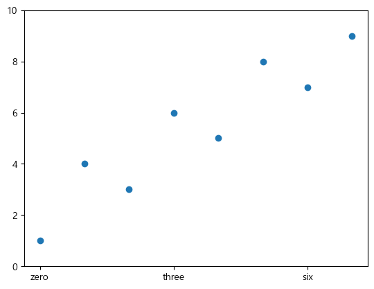
눈금 값 설정(xticks, yticks)
ticks에 tick의 위치를 지정하고, labels에 원하는 tick 이름을 지정할 수 있다.
plt.scatter(x=data.index, y=data['A'])
plt.xticks(ticks=[0,3,6], labels=['zero', 'three', 'six'])
plt.ylim(bottom=0, top=10)
xticks나 yticks에 값을 1개만 주면 ticks parameter가 설정된다.
plt.scatter(x=data.index, y=data['A'])
plt.xticks([0,3,6])
plt.ylim(bottom=0, top=10)
참고로 막대그래프는 기본적으로 막대의 중심 좌표를 기준으로 계산하지만 align parameter를 주면 왼쪽 위치로 계산할 수 있다.
plt.bar(data.index, data['B'], align='edge')
plt.xticks([0,3,6], ['zero', 'three', 'six'])

그래프 저장(savefig)
plt.scatter(x=data.index, y=data['A'])
plt.savefig("gorio.png", dpi=300)
dpi는 dot per inch의 약자이다. 높을수록 해상도가 좋아지고 파일 크기도 커진다.
References
- https://wikidocs.net/book/5011
- https://matplotlib.org/stable/api/_as_gen/matplotlib.lines.Line2D.html